Logos are one of the most essential parts of a business’s visual identity. A logo is a symbol that represents a company’s values, mission, and culture. It is the first thing that comes to mind when someone thinks of a business, and it is crucial to make a lasting impression. The colours used in a logo play a vital role in defining the brand’s personality and image. In this article, we will discuss the best logo colours and their combinations and why they are effective.
Understanding the Psychology of Colours in Logo Design
Colours evoke emotions and play a significant role in how people perceive a brand. They can evoke specific feelings and reactions in people, making them a powerful tool in logo design. Here are some of the most common colours used in logo design and their meanings:
- Red is associated with energy, excitement, and passion. Fast-food chains typically use it in their logos to convey urgency.
- Blue is associated with trust, loyalty, and stability. It is often used in logos for financial institutions, healthcare providers, and tech companies.
- Green is associated with growth, health, and nature. It is commonly used in logos for eco-friendly companies, organic food companies, and health products.
- Yellow is associated with optimism, creativity, and happiness. It appears in logos for children’s products, entertainment, and food.
- Orange is associated with enthusiasm, warmth, and excitement. This colour pattern is often used by sports teams, technology companies, or fast food chains.
- Purple is associated with luxury, royalty, and creativity. It is often used in logos for beauty products, fashion, and high-end services.
Types of Colour Combination in Logo Design
Different colours create different visual effects and convey various meanings. To help you understanding how to select a colour combinations that works in your favour, let’s explore the its logo design types:
- Complementary: Complementary colours are opposite each other on the colour wheel. They create a high-contrast effect that can make a logo stand out. For example, blue and orange or red and green.
- Analogous: Analogous colours are next to each other on the colour wheel. They create a harmonious and cohesive effect that can make a logo look unified. For example, blue, green, and teal.
- Triadic: Triadic colours are three colours that are evenly spaced on the colour wheel. They create a vibrant and balanced effect that can make a logo look dynamic. For example, red, blue, and yellow.
- Monochromatic: Monochromatic colours are different shades and tints of the same hue. They create a subtle and sophisticated effect that can make a logo look elegant. For example, different shades of blue.
- Split-complementary: Split-complementary colours are a variation of complementary colours. They use a base colour and two colours adjacent to its complementary colour. For example, blue with yellow-orange and red-orange
The choice of colour combination will depend on the brand’s personality, target audience, and industry as well as the goals you want to achieve and the latest logo design trends.
Best Logo Colour Combinations with Examples
Now that we understand the psychology of colours and their main combination patterns, let’s take a closer look at the best logo colour combinations you can apply to your design.
Blue and White
This combination is clean, simple, and timeless. It conveys trust, and stability, making the brand a reliable partner. It is often used in logos for financial institutions, healthcare providers, and tech companies. The Barclays Bank logo features a blue eagle on a white background. This colour combination conveys trust and reliability, which are essential qualities for a financial institution.
Red and Yellow
This combination is energetic, playful, and attention-grabbing. It is often used in logos for fast-food chains, entertainment, and children’s products. The iconic McDonald’s logo features red lettering with yellow arches. This colour combination is perfect for a fast-food chain.
Black and White
This combination is classic, elegant, and sophisticated. It conveys power, authority, and professionalism, and is often used in logos for luxury brands, high-end products, and services.
The Burberry logo features the company name in black lettering on a white background. This classic colour combination transmits power, authority, and professionalism, making the brand reliable and bold in the customers’ eyes.
Yellow and Blue
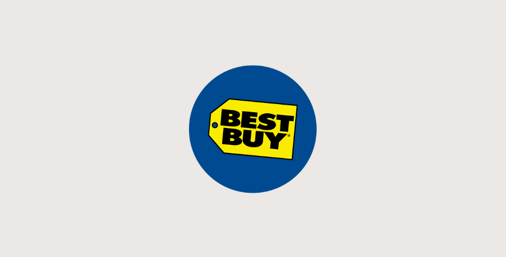
This combination is eye-catching, refreshing, and harmonious. It conveys growth, energy, and stability. It is a perfect option for logos for e-commerce, big corporations or small local companies selling goods. The Best Buy logo features a blue and yellow tag with a yellow price tag inside a blue circle, and the words “Best Buy” in bold blue text.
Green and Yellow
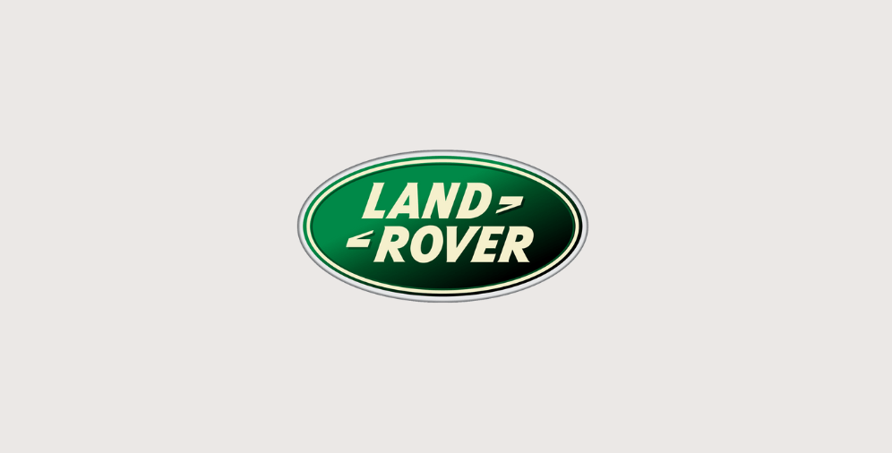
This combination is bright, cheerful, and vibrant. It is often used in logos for eco-friendly companies, health products, or big corporations. The Land Rover logo features a green oval with the company name in yellow lettering, making it bold and outstanding.
Yellow and Black
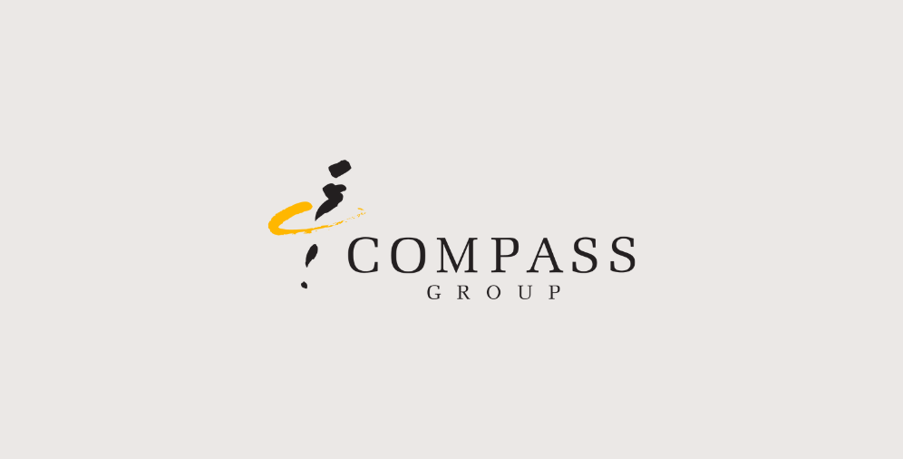
This combination is attention-grabbing, bold, and modern. It is often used in logos for technology companies, sports teams, and fast-food chains. Compass Group logo colours portray a modern, professional, and forward-thinking image for the company.
Orange and Blue
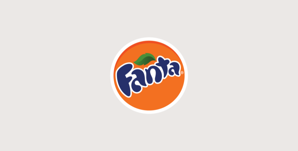
This combination is bold, energetic, and modern. It conveys enthusiasm, excitement, and innovation. It is often used in logos for sports teams, technology companies, and fast-food chains. The Fanta logo uses a playful combination of orange and blue to create a fun and energetic feel.
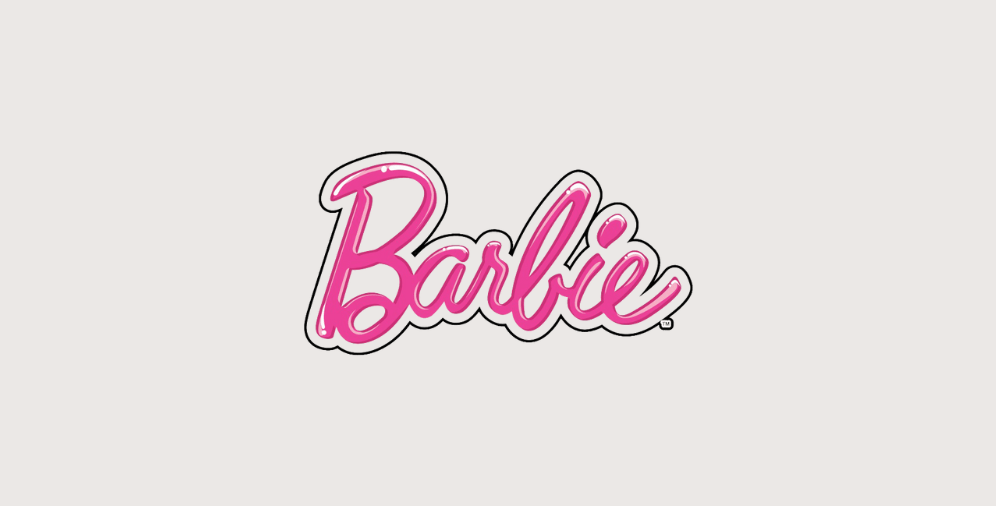
Purple and Pink
This combination is playful, and creative. It conveys luxury, creativity, and beauty. It is often used in logos for beauty products, fashion, and high-end services. Barbie’s logo features a bright pink colour with a deep purple accent that perfectly captures the brand’s playful and feminine identity.
Tips for Choosing the Right Colour Combination for Your Logo
Choosing the right colour combination for your logo can be challenging, but here are some tips to help you make the right decision:
- Consider your brand’s personality – Your brand’s personality should guide your colour choices. If your brand is playful and energetic, you may want to choose a bright colour combination. If your brand is sophisticated and elegant, you may want to choose a classic colour combination.
- Think about your target audience – Your target audience should also guide your colour choices. If you’re targeting children, you may want to choose a bright and colourful combination, while if you’re targeting professionals, you may want to choose a more muted and sophisticated colour combination.
- Look at your competitors – It’s important to differentiate yourself from your competitors, so look at their logos and colour choices. Choose a colour combination that will make you stand out and be memorable.
- Consider the medium – The medium in which your logo will be used should also guide your colour choices. Some colours may not translate well to different mediums, such as print versus digital. Make sure your colour combination works well in all mediums.
- Test your colour combination – Before finalising your logo and colour combination, test it out with your target audience. Get feedback and make any necessary adjustments.
Making a Lasting Impression: How Colour Combinations Impact Brand Identity
In conclusion, selecting the right colours for your logo is crucial in defining your brand’s personality and image. Understanding the psychology behind colours and their meanings is essential in making the right colour choices. There are many effective colour combinations, and it’s important to consider your brand’s personality, target audience, and competitors when making your decision. With the right colour combination, typography, your logo can make a lasting impression and help you stand out in a crowded market.
If you are uncertain about which colours to choose for your logo, we invite you to contact our logo design agency in Manchester. Our team of experts will guide you through the process and help you make an informed decision that aligns with your brand’s personality and values.