A logo is a crucial element of a brand’s identity, as it is often the first thing that customers notice when interacting with a business. While we have previously covered the logo design process in our comprehensive guide, the challenge is to create a logo that is visually appealing and memorable enough to help your business stand out.
Keeping up with the latest logo trends can ensure an effective performance. In this article, we will share some of the current logo design trends that have been gaining popularity in recent years. From Art Nouveau-inspired designs to animated logos, we’ll dive into the key features of each trend and provide examples of brands that have successfully incorporated them into their logo design.
The Role of Logo Design Trends in Building a Strong Brand Identity
Before we delve deeper, let’s first discuss why embracing logo design trends is important for businesses.
- Firstly, a well-designed logo can create a positive first impression and help to establish a strong brand identity. By following the latest logo trends, businesses can ensure that their logo looks current and relevant, and that it resonates with their target audience.
- Secondly, logo design trends can also be an indicator of changes in consumer preferences and values. Knowing what is in demand, businesses can stay in tune with their target audience needs and adapt their branding strategy accordingly. For example, if minimalist designs are becoming more popular, it may be a sign that customers are looking for simpler, more streamlined experiences. By incorporating this trend into their logo design, a business can communicate that they are in touch with their customers’ preferences and values.
- Finally, logo trends can also help businesses to differentiate themselves from their competitors and create a logo that is visually striking and memorable.
The Ultimate Guide to Logo Trends for 2023 with Tips And Examples
From minimalist designs to bold colours and textured elements, there are numerous trends that will shape the logo design landscape in 2023. We compiled a list of the most outstanding trends with tips and examples to inspire and guide you in creating a logo that captures the essence of your brand and connects with your target audience.
#Art Nouveau-Inspired Designs: Embrace Flowing Lines and Ornate Details
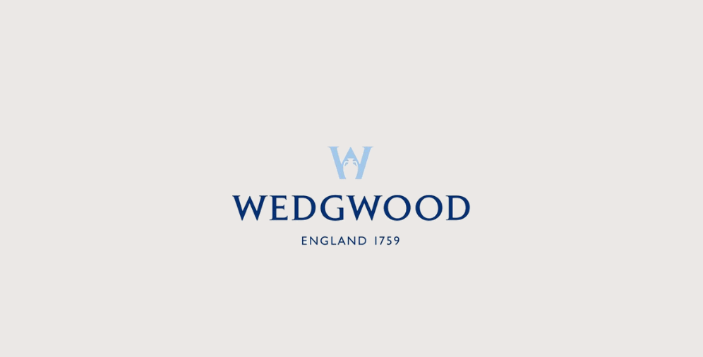
Art Nouveau is a design style that emerged in the late 19th century and is characterised by its flowing lines and ornate details. To create an Art Nouveau-inspired logo, you can incorporate organic shapes, intricate patterns, and flowing lines. Consider using script or ornate typography to add a decorative element, and stick to a muted or earthy colour palette to achieve a vintage look and feel. For example, take a look at the Wedgwood, a British pottery and ceramics manufacturer that was founded in the late 18th century. Their Art Nouveau-inspired logo features a stylized “W” with flowing, organic lines and floral motifs.
Tips for creating an Art Nouveau-inspired logo:
- Use organic shapes and flowing lines to create a sense of movement and flow.
- Incorporate ornate details, patterns, and typography to highlight a decorative element.
- Use a muted or earthy colour palette to maximise a vintage look and feel.
#Retro-Inspired Designs: Add a Touch of Nostalgia to Your Logo
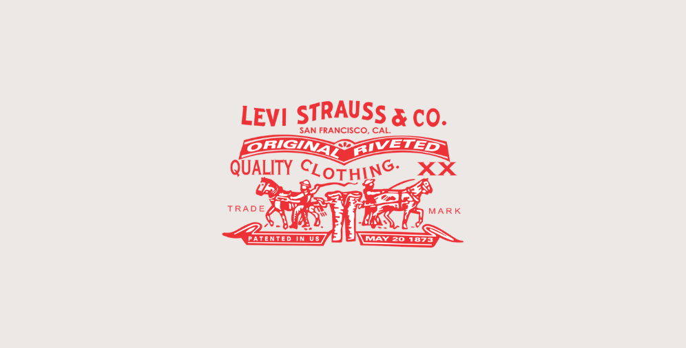
If you’re looking for a playful and nostalgic design style, consider retro-inspired logos that draw inspiration from the 1950s, 60s, and 70s. Use bold colours, playful typography, and vintage-style illustrations to create a retro vibe. Incorporating elements like stars, stripes, or polka dots can also add to the nostalgic feel. The Levi Strauss is a great example of a retro-inspired logo, featuring a bold font and vintage-style illustrations.
Tips for creating a retro-inspired logo:
- Use bold colours and playful typography to create a sense of fun and playfulness.
- Incorporate vintage-style illustrations or graphics to emphasise a nostalgic feel.
- Use elements such as stars, stripes, or polka dots for a retro vibe.
- Choose a font that is bold and eye-catching to make a strong visual impact.
#Minimalist Designs: Keep It Simple and Clean
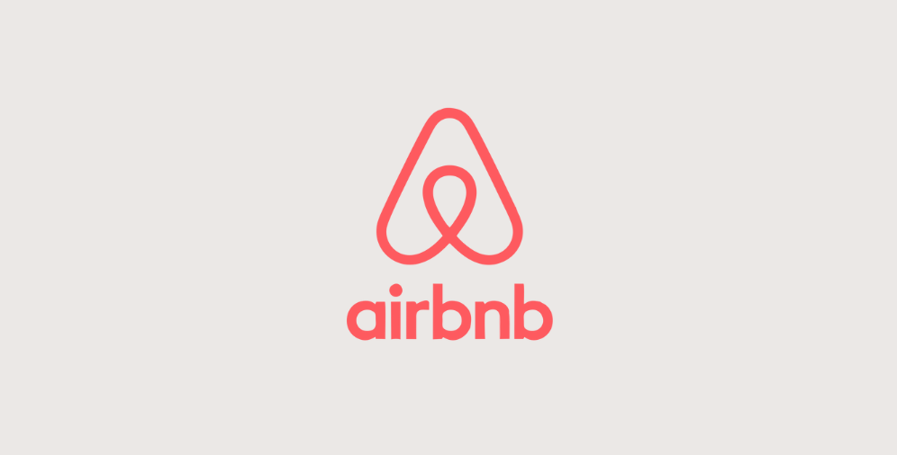
Minimalism is all about simplicity and clean lines. For a minimalist logo, use a simple font, a limited colour palette, and geometric shapes. Avoid adding unnecessary details and keep the design streamlined. Minimalist logos can evoke feelings of elegance, sophistication, and modernity. Take a look at the Airbnb logo, which features a simple, geometric shape and clean typography.
Tips for creating a minimalist logo:
- Use a simple font and a limited colour palette to create a clean and modern look.
- Incorporate geometric shapes and avoid unnecessary elements for a simple and streamlined design.
- Choose a font that is simple and easy to read to craft a timeless look.
#Gradient Designs: Add Depth and Dimension to Your Logo
Gradients can add depth and dimension to your logo design. Use colours that blend seamlessly into each other to create a smooth gradient effect. Consider using a gradient to create a sense of movement or depth, and choose colours that represent the emotions you want your brand to evoke. A simple font that is easy to read can help balance out the design. The Instagram logo is a great example of a gradient logo, featuring a vibrant gradient of blues and purples.
Tips for creating a gradient logo:
- Use colours that blend seamlessly for a smooth gradient effect.
- Consider using a gradient to develop a sense of movement or depth.
- Choose colours that evoke the emotions you want your brand to represent.
#Geometric Designs: Embrace Simple Shapes for a Modern Look
Geometric shapes can create a modern and sleek logo design. Use simple shapes like circles, squares, and triangles to experiment with different arrangements and sizes. A font that complements the geometric shapes can create a cohesive design. Negative space can also be used to create interesting and dynamic designs. The Nike logo, which features a simple swoosh shape, is a great example of a geometric logo design.
Tips for creating a geometric logo:
- Use simple shapes such as triangles, squares, or circles to create a modern and sleek design.
- Experiment with different arrangements and sizes for unique design.
- Use negative space to build interesting and dynamic designs.
#Textured Designs: Add Visual Interest and Depth to Your Logo
Texture can add depth and authenticity to a logo design. To create a textured logo, consider using patterns, gradients, or hand-drawn elements to add a unique texture to the design. Contrasting textures can create an eye-catching design. Textured logos can evoke feelings of authenticity, warmth, and personality. For instance, the Toms Shoes logo features a hand-drawn pattern with a textured look.
Tips for creating a textured logo:
- Use patterns, gradients, or hand-drawn elements to create a unique texture in the design.
- Consider using contrasting textures and proper fonts for a cohesive design.
- Use a limited colour palette to create a balanced picture.
#Animated Logos: Bring Your Logo to Life with Motion
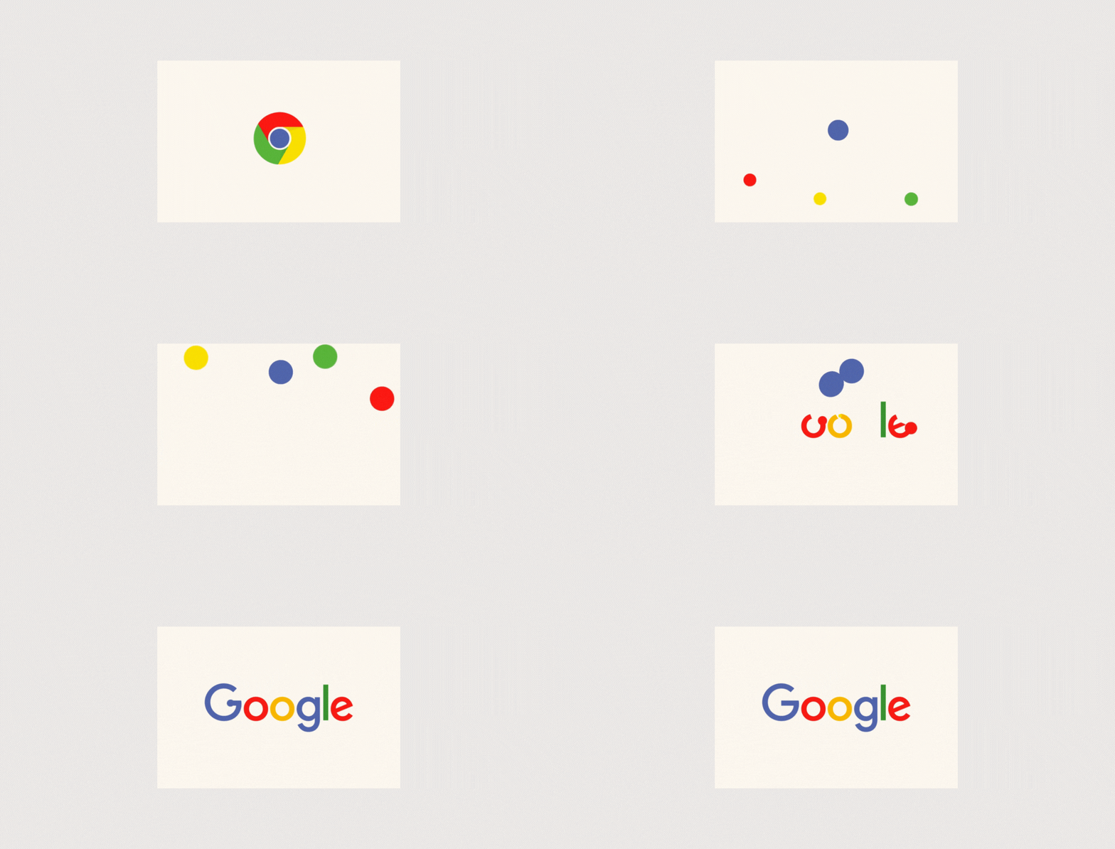
Animated logos use movement to make the design more engaging. To create an animated logo, consider using motion graphics or animation to create movement in the design. You can animate typography or illustrations to create an engaging visual experience. Animated logos can evoke feelings of excitement, creativity, and innovation. A great example is the Google logo, which features a playful animation when displayed on a search page.
Tips for creating an animated logo:
- Use motion graphics or animation to introduce movement in the design.
- Animate elements such as typography or illustrations for an engaging visual experience.
- Keep the animation short and simple to avoid overwhelming the viewer.
- Consider the emotional impact you want the animation to have on the viewer.
#Morph Logos: Use Shape-Shifting for a Dynamic Visual Experience
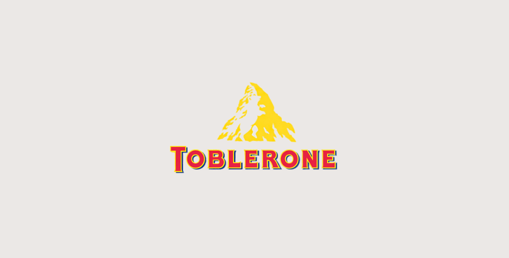
Morph logos use shape-shifting to create a dynamic visual experience. To create a morph logo, use a simple shape or illustration that can transform into another shape or illustration. Animation can be used to create the shape-shifting effect. Morph logos can evoke feelings of transformation, innovation, and creativity. The Toblerone logo is a great example of a morph logo, featuring a mountain shape that morphs into a bear shape.
Tips for creating a morph logo:
- Use a simple shape or illustration that can transform into another shape or illustration.
- Use animation to make the shape-shifting effect.
- Use a limited colour palette to create a balanced design.
Logo Design Trends: Staying Current and Relevant in the Market
Predicting logo design trends is not an easy task as they change rapidly, influenced by various factors such as cultural shifts, emerging technology, and evolving consumer preferences. But believe us, it is worth considering these current logo trends to enhance your online presence.
In deciding whether to follow logo design trends, it is crucial to consider your brand identity and marketing strategy. While keeping up with trends can help your brand stay current and relevant, it is equally important to ensure that your logo accurately reflects your brand’s values and effectively communicates with your target audience.
If you are unsure about your logo design, do not hesitate to contact us for comprehensive assistance. We will make our best to keep you updated on the latest logo design trends to stay on top of the digital.
